If you come from the good old SAP Business Warehouse, you will remember the DB02 transaction. This transaction could show you all the tables in your system and how big they were. I showed an
example on LinkedIn last year
DB02 (Screenshot by sapbasisinfo.com)
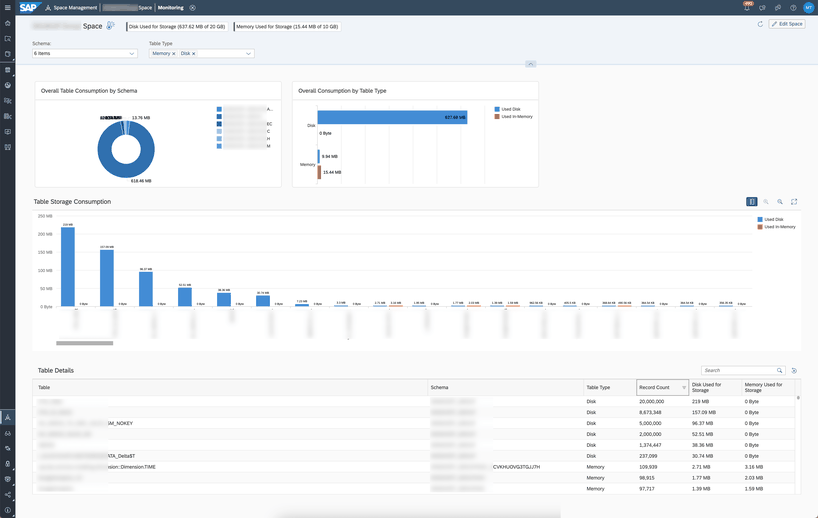
In SAP Datasphere, you have something similar in the Space Management Monitor. It lists all tables and persistent views with their size and number of records.
Datasphere: Space Monitor
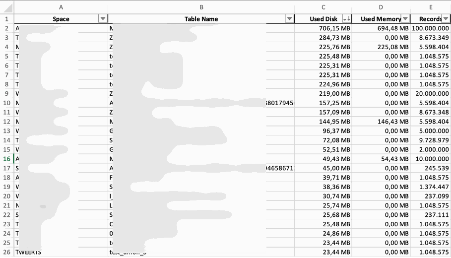
This is nice, but not ideal, because it is limited to the space you have chosen. I have written a little Python program that shows you all the tables and persistent views in one overview. At the
moment I always use Excel for the output, but you can modify this line and write it in the terminal or any other application.
The full source code is available on my GitHub
repository. But I will explain how it works here. As you know, authentication is moved to a separate class, so I don’t need it in all my programs again.
Start with the main function.
if __name__ =="__main__":
parser = argparse.ArgumentParser(description="Get an overview of all tables over all spaces")
parser.add_argument("-f", "--file", required=True, help="Path of parameter file")
args = parser.parse_args()
withopen(args.file, 'r') as f:
config = json.load(f)
secrets_file = config["SETTINGS"]["secrets_file"]
token_file = config["SETTINGS"]["token_file"]
dsp_host = config["DATASPHERE"]["dsp_host"]
# Now roll the dice and go to workprint("Started...")
get_database_tables()
print("Ended")
The tool has only one parameter which I use to read a JSON file for all the necessary information like, secret, token, URL and so on. The whole logic is based on my function
get_database_tables.
Get Database Tables
Here you have the OAuth first, and then I read the URL for all the spaces. The URL is https://xyz.eu10.hcs.cloud.sap/dwaas-core/api/v1/spaces
So now I have a list of all the spaces in my tenant and I go through each space with
this URL https://xyz.eu10.hcs.cloud.sap/dwaas-core/resources/spaces?tables=true&spaceids={spaceID}
There I have to change the SpaceID with each space, then loop through all the tables of my space and calculate all the key figures like used disk, used memory and records.
for spaceID in space_list:
url = utils.get_url(dsp_host, 'space_tables').format(**{"spaceID": spaceID})
response = requests.get(url, headers=header)
space_json = response.json()
try:
for table in space_json[spaceID]['tables']:
tableName = table['tableName']
usedDisk =round((table['usedDisk'] /1000/1000),2) # MB
usedMemory =round(table['usedMemory'] /1000/1000,2)
records = table['recordCount']
database_tables.append((spaceID, tableName, usedDisk, usedMemory, records))
exceptKeyError:
continue
So now I have all the tables in one place and can see if something is wrong across the tenant. I hope you like this, and if you have any questions, use the comments below.
author.
Hi,
I am Tobias, I write this blog since 2014, you can find me on LinkedIn and YouTube. I work as a Data &
Analytics Consultant. If you want, you can leave me a PayPal coffee donation.
You can also contact me directly if you want.
Now that we know how to authenticate to the SAP Datasphere API. We can now look at my example that I posted on LinkedIn last year. The goal is to get all the views that are exposed for
consumption. If you set this flag, you can consume this view with a 3rd party tool such as PowerBi.
So if a view is flagged as exposed for consumption, this could be a data leakage issue if there is no Data Access Control (DAC) in place. So I also want to see if a view is exposed
and if so, if it has a Data Access Control assigned to it. This allows me to identify incorrectly exposed views and see if anyone has access to data without DACs.
All code examples are available on my GitHub repository.
Every tool has the authentication part, so I moved it to a separate class. If you want to know how to build it, read the last blog post.
1. Start the program
So let’s start with the explanation of the program. As I will be using it from the terminal, I want to parametrize it and not have any fixed values inside. To do this, I use the
ArgumentParser for the config file and the space name I want to check. I read the parameter for all the necessary information like the host, the password and so on from it.
if __name__ =="__main__":
parser = argparse.ArgumentParser(description="Get all exposed views of a space")
parser.add_argument("-f", "--file", required=True, help="Path of parameter file")
parser.add_argument("-s", "--space", required=True, help="Space")
args = parser.parse_args()
withopen(args.file, 'r') as f:
config = json.load(f)
dsp_host = config["DATASPHERE"]["dsp_host"]
dsp_space = args.space
hdb_address = config["HDB"]["hdb_address"]
hdb_port = config["HDB"]["hdb_port"]
hdb_user = config["HDB"]["hdb_user"]
hdb_password = config["HDB"]["hdb_password"]
# Now roll the dice and go to workprint("Started...")
get_exposed_views()
print("Ended")
I always use this logic, so I don’t have to declare all the information in each tool. The JSON file I read has the following structure:
The main function is the get_exposed_views function. There is the logon to the HANA Cloud Database to get the CSN annotations of all objects.
defget_csn_files():
# Connect to HDB
conn = dbapi.connect(
address=hdb_address,
port=int(hdb_port),
user=hdb_user,
password=hdb_password
)
cursor = conn.cursor()
# select statement to fetch csn's. Selection on highest ARTIFACT_VERSION for each object.
st = f''' SELECT A.ARTIFACT_NAME, A.CSN, A.ARTIFACT_VERSION FROM "{dsp_space}$TEC"."$$DEPLOY_ARTIFACTS$$" A INNER JOIN ( SELECT ARTIFACT_NAME, MAX(ARTIFACT_VERSION) AS MAX_ARTIFACT_VERSION FROM "{dsp_space}$TEC"."$$DEPLOY_ARTIFACTS$$" WHERE SCHEMA_NAME = '{dsp_space}' AND ARTIFACT_NAME NOT LIKE '%$%' AND PLUGIN_NAME in ('tableFunction', 'InAModel') GROUP BY ARTIFACT_NAME ) B ON A.ARTIFACT_NAME = B.ARTIFACT_NAME AND A.ARTIFACT_VERSION = B.MAX_ARTIFACT_VERSION; '''
cursor.execute(st)
rows = cursor.fetchall()
conn.close()
total_rows =len(rows)
print('Total rows: '+str(total_rows))
return rows
As you can see, we are selecting the csn column from the $TEC schema of the previously provided space. And return the rows to the get_exposed_views function.
Get exposed views
Once we have all the objects, we can loop through the CSN definitions of the objects. In the CSN annotation, there is a key called „consumption.external“. So we can read this parameter and see if
a view is exposed or not.
defget_exposed_views():
exposedViews = []
dac_objects = []
dac_items = []
# Get objects which are exposed
csn_files = get_csn_files()
for csn in csn_files:
csn = csn[1]
csn_loaded = json.loads(csn)
dac_objects.clear()
dac_items.clear()
objectName =list(csn_loaded['definitions'].keys())[0]
label = csn_loaded['definitions'][objectName]['@EndUserText.label']
try:
exposed = csn_loaded['definitions'][objectName]['@DataWarehouse.consumption.external']
exceptKeyError:
exposed =False
The next check is to see if the object has a Data Access Control (DAC) assigned to it. For this we have the key „dataAccessControl.usage“ which shows the information.
try:
for dac in csn_loaded['definitions'][objectName]['@DataWarehouse.dataAccessControl.usage']:
iflen(dac['on']) ==3: # one column mapping
dac_items.append(dac['on'][0]['ref'][0])
iflen(dac['on']) ==7: # two column mapping
dac_items.append(dac['on'][0]['ref'][0])
dac_items.append(dac['on'][4]['ref'][0])
dac_objects.append(dac["target"])
exceptKeyError:
dac_items.clear()
dac_objects.clear()
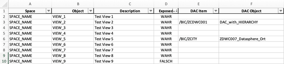
At the end I create a list which I publish via a Pandas data frame to Excel and format this Excel in the right way.
This is the magic to get all the views that are exposed and have a data access control assigned or not. This is the first of many ideas I would like to share with you using the Datasphere
API and HANA Cloud Database.
Thanks again to Andreas Dietz for the initial idea. Please share your thoughts in the comments.
author.
Hi,
I am Tobias, I write this blog since 2014, you can find me on LinkedIn and YouTube. I work as a Data &
Analytics Consultant. If you want, you can leave me a PayPal coffee donation.
You can also contact me directly if you want.
It is a while since I published my last post here. There are several reasons that I don’t write anything, for example, SAP does not publish new features for Analysis for Office or my current
project has no special cool new things I can talk about because it is mostly just maintenance and nothing hip. So it was very quiet here, and this is what I want to change. If you follow me on
Twitter, you could have seen this post.
The year is almost over, and I haven’t written a lot of post on my blog this year. I have to do it a lot more next year. Some #DataWarehouseCloud, #Python and also #ABAP topics are on my list.
So I will write some posts about Python, Data Warehouse Cloud, and some ABAP topics in the near future. This post starts with Python and how to analyze the Apple Health data.
You can export the health data from your iPhone and receive a ZIP file that contains an XML file. How you can do this can be found via Google. It is uncomplicated. In my case, my XML file was around 1 GB big, and it contains about 3 million entries
until May 2021. So I could not analyze it with Microsoft Excel or Notepad++, and I need only some information out of it, so I tried Python. I work with Python just more than one year, so please
be kind if it is not perfectly written code.
First we have to load the XML data.
fromlxmlimport etree
tree = etree.parse(r'path_to_xmlExport.xml')
root = tree.getroot()
# consider only records no workouts
records = tree.xpath("//Record")
With this code snippet, we load the XML file. We are only interested in the record data, so we read only this and not the workout data. If you are interested in your workout data, I will create
another example. The XML path is here //Workouts. The next step is to get the data and put it into a data frame.
importpandasaspd# fields we want to get
DATETIME_KEYS = ["startDate", "endDate"]
NUMERIC_KEYS = ["value"]
OTHER_KEYS = ["type", "sourceName", "unit"]
ALL_KEYS = DATETIME_KEYS + NUMERIC_KEYS + OTHER_KEYS
# Get all records where as source the apple watch is
df = pd.DataFrame([{key: r.get(key) for key in ALL_KEYS} for r in records if'Apple'in r.attrib['sourceName']])
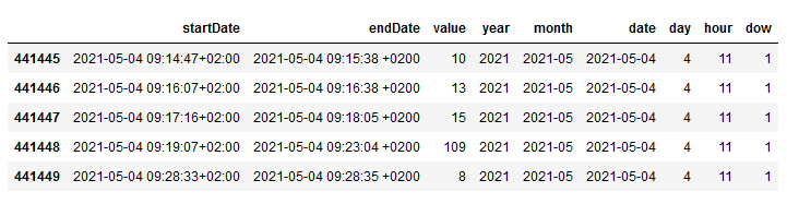
Now we have all data in the data frame and can display it with df.tail()
Raw data in a pandas data frame
In this example I want to focus on my steps, so we filter for the type HKQuantityTypeIdentifierStepCount.
The XML file with almost 1 GB size has become a CSV file with 50 MB. Now you can use Microsoft Excel to open it or process the data further with Python. I found a blog post that also analyzes Apple Health data. I
use this blog post to analyze my steps. First, we have to import some libraries.
fromdatetimeimport date, datetime, timedelta as td
importpytzimportnumpyasnpimportpandasaspdimportmatplotlib.pyplotasplt%matplotlib inline
After that, I use the conversion for the time column to get time fields I can use for aggregation. In my case, I use the time zone Berlin.
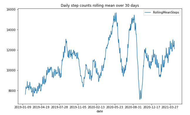
We can use the new data frame to visualize the result in a line chart diagram. I use the mean value of 30 days to show me an overview. You can change the value to your desire.
steps_by_date['RollingMeanSteps'] = steps_by_date.Steps.rolling(window=30, center=True).mean()
steps_by_date.plot(x='date', y='RollingMeanSteps', title='Daily step counts rolling mean over 30 days', figsize=[10, 6])
This is how it looks:
Steps counts rolling mean over 30 days
As you can see, I have a drop around the COVID-19 start, and as the lockdown in Germany started, I have an increase because we have done a lot of walking with the family. I think this is
impressive to see and to analyze for further analysis. So the next step is to get an overview of the weekdays. Therefore, we have to add the weekday to our data frame and visualize it in a
diagram.
steps_by_date['date'] = pd.to_datetime(steps_by_date['date'])
steps_by_date['dow'] = steps_by_date['date'].dt.weekday
data = steps_by_date.groupby(['dow'])['Steps'].mean()
fig, ax = plt.subplots(figsize=[10, 6])
ax = data.plot(kind='bar', x='day_of_week')
n_groups =len(data)
index = np.arange(n_groups)
opacity =0.75
ax.yaxis.grid(True)
plt.suptitle('Average Steps by Day of the Week', fontsize=16)
dow_labels = ['Monday', 'Tuesday', 'Wednesday', 'Thursday', 'Friday', 'Saturday', 'Sunday']
plt.xticks(index, dow_labels, rotation=45)
plt.xlabel('Day of Week', fontsize=12, color='red')
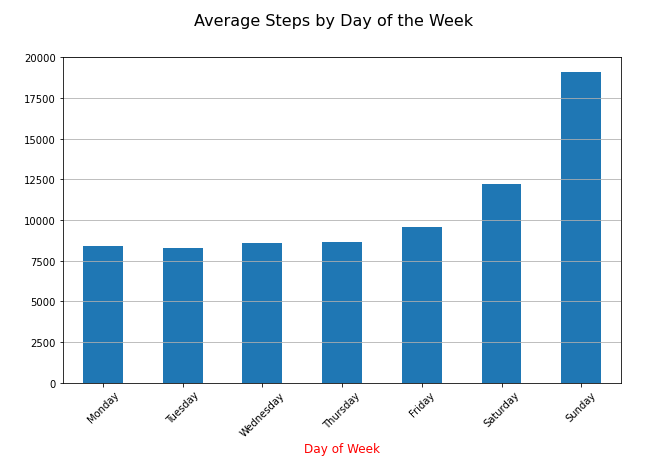
Average Steps by Day of the Week
The diagram shows what I already know. I do the most steps on the weekend. But I think it is also interesting that I have overall (2019 – 2021) nearly 8000 steps per day. And when I look into
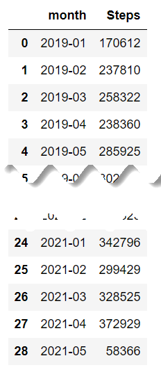
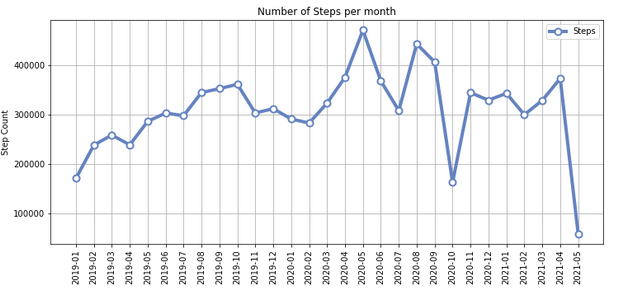
2021, only I have now almost 10,000 steps, even though I am still in my home office since COVID-19 started. Next, I created an overview of my monthly steps. In the monthly chart, we see an
increase during the lockdown in Germany, where you could go out for a walk or run.
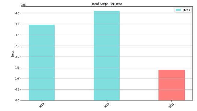
The last chart is an overview of my steps per year, which I already knew from the iPhone app Stepz.
Total steps per year
As I now have my data, I could also save it as a CSV file for later use and analyze the hours when I made my steps. It is interesting what you can do with all of this data.
Conclusion
So that’s it. I think it is only the iceberg tip of what you can do with Apple Health data. The next steps are to look into the heart rate and how it developed with my running exercises during
the two years and the visualization of GPS data. Maybe someone can provide me with a few tips, so I can improve my Python skills. Is there any good video course or book I should read? Leave a
comment below.
author.
Hi,
I am Tobias, I write this blog since 2014, you can find me on Twitter, LinkedIn, Facebook and YouTube. I work as a Senior Business Warehouse Consultant. In 2016, I wrote the first edition of . If you want, you can leave me a PayPal coffee donation. You can also contact me directly if you want.