reyemsaibot

SAP BI Blog about SAP BW/4HANA, Analysis for Office and SAP HANA - by Tobias Meyer

Schlagwort: excel

  • Analysis for Office Infofields, formulas & Dashboard

    Analysis for Office provides own Microsoft Excel formulas to show information
    of your data source. I want to explain some functions and how to use them in a dashboard or a report.

    • SAPGetVariable
    • SAPGetMember
    • SAPGetInfoLabel
    • SAPGetSourceInfo
    • SAPGetWorkbookInfo
    • SAPGetDimensionInfo
    • SAPListOF
    • SAPListOfDimensions
    • SAPListOfEffectiveFilters
    • SAPListOfDynamicFilters
    • SAPSetFilterComponent

    The function SAPGetVariable returns the value for a specific SAP Business Warehouse variable. For example:

    Cell A2: =SAPGetVariable(„DS_1″;“0S_CUS“;“VALUEASKEY“)


    This formula returns the key for the variable 0S_CUS. You can use this key to fill another formula to get other information. For example:


    Cell A3: =SAPGetMember(„DS_1″;“0SOLD_TO=“&A2;“0NAME“)


    If you don’t want to have two formulas you can merge them like this.


    Cell A4: =SAPGetMember(„DS_1“;“0SOLD_TO=“&SAPGetVariable(„DS_1″;“0S_CUS“;“VALUEASKEY“);“0NAME“)


    The result is still the same.

    Analysis for Office SAPGetMember & SAPGetVariable
    Analysis for Office SAPGetMember & SAPGetVariable

    The formula =SAPGetInfoLabel returns language-dependent label for an info field. This is really nice, if you have colleagues or customers who are not familiar with one language. For
    example:


    Cell B5/B6: =SAPGetSourceInfo(„DS_1“; „InfoProviderName“)

    Analysis for Office SAPGetSourceInfo
    Analysis for Office SAPGetSourceInfo

    The information is either workbook or data source related. Which are exactly workbook or data source related can be checked in the user guide of Analysis for Office. For a dashboard these are relevant:


    • LastRefreshedAt
    • WorkbookName
    • LastDataUpdate
    • LastDataUpdateMaximum
    • QueryTechName
    • QueryLastRefreshedAt
    • InfoProviderTechName
    • System


    To get values for the above-mentioned info fields, you have to use SAPGetWorkbookInfo and SAPGetSourceInfo.


    Cell A7: =SAPGetInfoLabel(„QueryTechName“)

    Cell B7: =SAPGetSourceInfo(„DS_1“; „QueryTechName“)

    Analysis for Office SAPGetInfoLabel & SAPGetSourceInfo
    Analysis for Office SAPGetInfoLabel & SAPGetSourceInfo

    Cell A8: =SAPGetInfoLabel(„WorkbookName“)

    Cell B8: =SAPGetWorkbookInfo(„WorkbookName“)

    Analysis for Office SAPGetWorkbookInfo
    Analysis for Office SAPGetWorkbookInfo

    Cell A9/A10: =SAPGetDimensionInfo(„DS_1″;“0SOLD_TO“;“ATTRIBUTE“;“0CITY“)

    Analysis for Office SAPGetDimensionInfo
    Analysis for Office SAPGetDimensionInfo

    As you can see the first entry is in English, the second in German. This is also nice for an international Excel dashboard.


    To get an overview of the existing DataSources you can use the formula =SAPListOf.

    Analysis for Office SAPListOf
    Analysis for Office SAPListOf

    As you can see my workbook contains two data sources. When you build a dashboard it is good to see which data source you need for the data.


    If you want to display which dimensions are available in this data source you can use =SAPListOFDimensions.

    Analysis for Office SAPListOfDimensions
    Analysis for Office SAPListOfDimensions

    If you only want to see which Dimensions are in rows, you have to use this


    Cell A27: =SAPListOfDimensions(„DS_1″;“AXIS“;“ROWS“)


    For Columns

    Cell A29: =SAPListOfDimensions(„DS_1″;“AXIS“;“COLUMNS“)


    For Filter

    Cell A32: =SAPListOfDimensions(„DS_1″;“AXIS“;“FILTER“)

    Analysis for Office SAPListOfDimension Detail
    Analysis for Office SAPListOfDimension Detail

    If you want to display the filters of your dashboard, you have different formulas. For example:


    =SAPListOfEffectiveFilters returns a list of all filters of a data source including dynamic filters defined by a user, static filters in the query and measure filter. If you want either
    dynamic filters or measure filters you also can use =SAPGetListOfDynamicFilters or =SAPGetListOfMeasureFilters.


    It depends on what you want to show in a report. If you want to make your dashboard interactive you can use =SAPSetFilterComponent, so the user can decide what to filter on a
    specific data source


    For example, this formula shows a filter for 0SOLD_TO and applies to all data sources in this workbook.


    Cell A36: =SAPSetFilterComponent(„DS_1″;“0SOLD_TO“;“ALL“;“MULTIPLE“)

    Analysis for Office SAPSetFilterComponent
    Analysis for Office SAPSetFilterComponent

    You also get a little filter icon to select via a dialog box your values.

    So after the technical stuff is done, we can create our dashboard. I want to build a simple dashboard with a chart and a table, where the user can decide which data he wants to see.

    Analysis for Office Dashboard Example
    Analysis for Office Dashboard Example

    For the customer number in cell A1 we use this formula =SAPGetVariable(„DS_1″;“0S_CUS“;“VALUEASKEY“) because the user has to select a customer in the prompt dialog. For the name and
    address I used the following commands:


    Name: =SAPGetMember(„DS_1″;“0SOLD_TO=“&A1;“0NAME“)

    Postal Code and City: =SAPGetMember(„DS_1″;“0SOLD_TO=“&A1;“0POSTAL_CD“) & “ “ & SAPGetMember(„DS_1″;“0SOLD_TO=“&A1;“0CITY“)


    For the date I use the last refreshed of the query: =SAPGetWorkbookInfo(„LastRefreshedAt“).  To display the last data update I use the formula =SAPGetSourceInfo(„DS_1“;
    „LastDataUpdate“)
    . For the InfoProvider I use =SAPGetSourceInfo(„DS_1“; „InfoProviderTechName“).


    For the data of the table I use formulas like =SAPGetData(„DS_1″;“Net price“;“0MATL_GROUP=060″)


    As you can see, it is very easy to build a beautiful report without any VBA coding. I hope this post help you to build your own dashboard. If you
    like, you can share some of your ideas either via the comments or just send me a mail.

    Update 21.05.2021:

    As Jim mentioned in the comments I had a mistake that in some formulas the &-symbol was missing to concatenate the string correctly

    author.


    Hi,

    I am Tobias, I write this blog since 2014, you can find me on twitterfacebook and youtube. I work as a Senior Business
    Warehouse Consultant. In 2016 I wrote the first edition of . If you want you can leave me a paypal coffee
    donation. You can also contact me directly if you want.


  • Analysis Office Table Design, API and Design Rules

    Since Analysis for Office 2.0 you have the option Table Design. You can now create new empty rows and columns.

    SAP Analysis for Office Table Design
    SAP Analysis for Office Table Design

    So you were able to use own Excel formulas in a Crosstab. But in Analysis for Office 2.0 the formulas disappeared when you refreshed a query. Since Analysis for Office 2.2 the Excel formulas
    survive a refresh. This is a really nice function. You can read this in the post „Analysis for
    Office: How to work with Excel formulas
    „.


    Now in Analysis for Office 2.2 SP3 the Table Design API got new rather advanced features like
    SAPSetText or SAPInsertLine. SAPInsertLine has now two new options for the parameter PositionBy:

    • DimensionGroup
    • Tuple

    With SAPInsertLine you can add a new row or column via VBA. For Example:

    Dim RuleId as String

    RuleId = Application.Run(„SAPInsertLine“, „NewLine1“, „DS_1“, „After“, „Dimension“, „0CALYEAR“)

    With this command you add a new columns after the dimension 0CALYEAR. Be careful the Help file declares lResult as Long but this is wrong! To explain all SAPInsertLine parameter
    I will write an own post.


    You can use SAPSetText to add texts to inserted cells. You can also rename measures in the crosstab. At the moment I haven’t got any more information about this function. In Analysis for Office 2.3 you get a new feature, called Design Rules tab. You find the Design Rules on the 4th tab of the
    Design Panel.

    SAP Analysis for Office Design Panel
    SAP Analysis for Office Design Panel

    On the Design Rules tab you can see and edit the rules created with Table Design. The rules are displayed per DataSource and rule type. First you select the DataSource and then the rule type. You
    can actually choose between four rule types:

    • Format
    • Formula
    • Text
    • New Lines

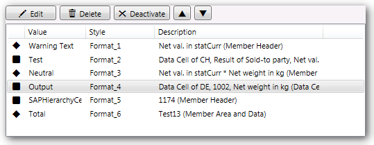
    The accessible rule types are displayed in a Dropdown Box for the selected DataSource. The first column show you if the rule is active or deactivated. If you see a square the rule is active, if
    you see a diamond the rule is deactivated. If you deactivate a NewLine-Ruletype the line disappear from the table design.

    Analysis Office Design Rules Active Rule
    Active Rule
    Analysis Office Design Rules Deactivate Rule
    Deactivate Rule


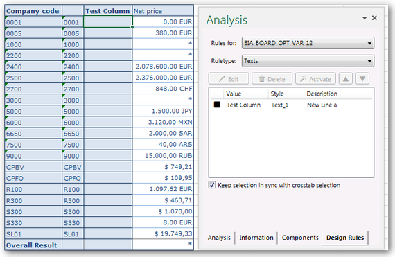
    The value column show for example the content of a text rule.

    SAP Analysis for Office Design Rules Ruletype Text
    SAP Analysis for Office Design Rules Ruletype Text

    The style is an ID that is unique for each rule. The description is automatically set by the Analysis for Office for formats, formulas and texts. NewLines haven’t got a description.


    The priority of a rule can be changed by the arrows above the list. You can easily move the rules up and down.

    SAP Analysis for Office Design Rules Move Rule
    SAP Analysis for Office Design Rules Move Rule

    You can edit only formats and new line-rules directly from the Design Rules tab. The other rules can only be deleted, activate or deactivate in the Design Rules tab.


    Note: You can only edit new line rules after you change the height of a new line once manually.


    If you have a large report with many design rules you love the feature „Keep selection in synch with crosstab selection“ because if you select a cell in the crosstab, the associated rule is
    highlighted in the text.


    Note: It is highlighted only if you are in the right list. For example if you click on a formula, but your list is on new line, nothing happened.


    If you want to remove all Table Design modifications, switch to the components tab and choose Reset Data Source in the context menu.

    author.


    I am Tobias, I write this blog since 2014, you can find me on twitter and youtube. If you want you can leave me a paypal coffee donation. You can also contact me directly if you want.

  • BEx Query Average vs. Excel Average

    When I was recently creating a new query at a customer, I have found a strange phenomenon. The query should show the average ticket number of a department. First you see the explanation and then
    I provide the solution of the problem.


    The query should show the individual, cumulative and average monthly values, as you can see in the screenshot.

    BEx Analyzer Average false values
    BEx Analyzer Average false values

    As you can see, there are no values for the months of May, June, August, November and December, so the cumulative values remain the same as the previous month.

    Unfortunately the calculation of the average has a problem, when a column has no value (for example May). In comparison the average value with the Excel formula AVERAGE.

    BEx Analyzer Average vs. Excel Average
    BEx Analyzer Average vs. Excel Average

    As you can see in the screenshot above, the key figures differ between the Excel formula and the result from the BEx Analyzer. According to the Excel formula the month of May has an average of
    43, according to the BEx Analyzer it has an average of 16. This is a large deviation. As you can see this error runs through all months after one column has no value.


    The interesting thing about the query is, if you have a department that has values from January to December, the average of the Bex Analyzer
    works without problems.

    BEx Analyzer Year Average vs. Excel Average
    BEx Analyzer Year Average vs. Excel Average

    The line Avg. no. tickets is identical to the line Excel formula AVG. That means the query definition is correct and working. But if there are months where no values have been
    posted, the average calculation of the BEx Analyzer failed.


    The following settings have been made to the key figures:


    No of tickets cumulated: the key figure is only cumulative, otherwise no further calculations.

    Selection Cumulated
    Selection Cumulated

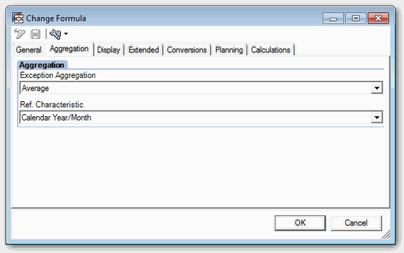
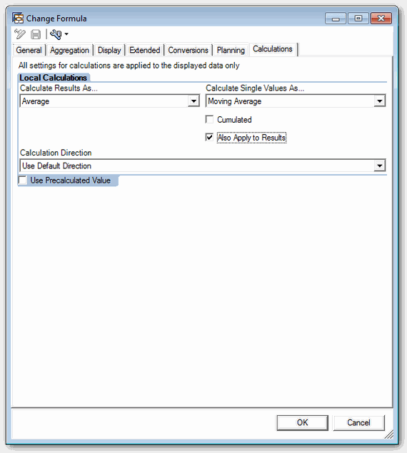
    Avg. no tickets: Aggregation on average with reference characteristic to Calendar Year/Month (0CALMONTH) and calculating the individual values and results as average or moving average.

    BEx Query Formula Aggregation
    BEx Query Formula Aggregation
    Bex Query Designer Formula Calculations
    Bex Query Designer Formula Calculations

    The question arises to me now is, why it works correctly when the entire year have posted values, but not when there are months without value. The cumulative value is also correctly calculated
    and doesn’t show an error. Only the average value is incorrect. Unfortunately, that was a problem for my client, since the report was intended of the controlling department and this department,
    you surely know, love Excel 😉


    So why the BEx Analyzer does interprets a blank line at cumulative values as 0, but failed if you want to calculate an average.


    So that the controlling department get the same result in the Bex Analyzer like with the Excel formula, we needed a solution. After a little research I found this SCN article, which says insert a new formula and add to this formula a 0. So nothing
    complicated, just a simple solution.

    BEx Analyzer Formula + 0
    BEx Analyzer Formula + 0

    As you can see on the screenshot below, the row Avg no of tickets + 0 has now another value than the row avg no of tickets. The cumulative value is identical.

    BEx Analyzer Average fixed with 0
    BEx Analyzer Average fixed with 0

    Now the comparison with the Excel formula AVERAGE:

    BEx Analyzer AVG + 0 and Excel AVG
    BEx Analyzer AVG + 0 and Excel AVG

    And as you can see now, the row avg. no of tickets + 0 and the row Excel formula AVG are identical. So I only have to hide the unnecessary rows and the query can be used. I hope
    this may help someone when you walk into the same issue. 😉

    author.


    I am Tobias, I write this blog since 2014, you can find me on twitter and youtube. If you want you can leave me a paypal coffee donation. You can also contact me directly if you want.

  • Sum many ranges with ALT=

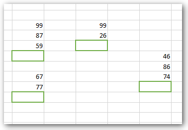
    I just found a very good tip at Chandoo’s blog, how you can sum many ranges with multi-select.

    Excel ranges

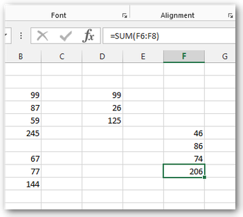
    You have to select each sum-row with CTRL and press ALT + = (ALT & Shift & 0). Now every sum-row has it own =sum() formula.

    Excel sum

    author.


    I am Tobias, I write this blog since 2014, you can find me on twitter and youtube. If you want you can leave me a paypal coffee donation. You can also contact me directly if you want.

  • Analysis Office: How to work with Excel formulas

    In Analysis for Office 2.2 a new feature was published. You can now use your own Excel formulas in a Crosstab. First you have to add a row or column in your Crosstab. The table design is a feature since Analysis for Office 2.0.


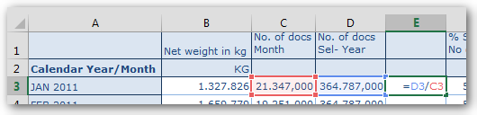
    You can add your formula.

    Excel formula in SAP Analysis for Office Crosstab
    Excel formula in Analysis for Office Crosstab

    Then you can drag your formula down to the end of the Crosstab.

    Expand Excel formula in SAP Analysis for Office Crosstab
    Expand Excel formula in Analysis for Office Crosstab

    When you now add a new characteristic to the rows, you will see the Excel formula will be automatically adjusts.

    Expand Excel formula in SAP Analysis for Office Crosstab
    Expand Excel formula in Analysis for Office Crosstab

    author.


    I am Tobias, I write this blog since 2014, you can find me on twitter and youtube. If you want you can leave me a paypal coffee donation. You can also contact me directly if you want.

  • One further Excel Dashboard Example

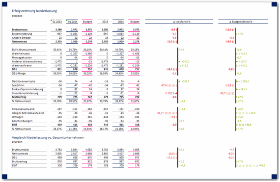
    The previous post about Excel Dashboards has such an appeal found, so I want to show another example.

    Both of these graphics are optimized for one A4 page. Which works better?

    author.


    I am Tobias, I write this blog since 2014, you can find me on twitter and youtube. If you want you can leave me a paypal coffee donation. You can also contact me directly if you want.

  • Create simple Excel Dashboards

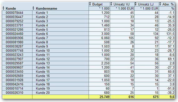
    You want to use the data which is provided by the Business Warehouse in your monthly report or any other report. The SAP Reporting tools like
    BEx Analyzer or Analysis for Office provides this data in „data tables“. These
    are not easy to read and maybe it isn’t possible to see at first glance what you want to express.

    SAP Analysis for Office: BEx Analyzer result
    SAP BEx Analyzer result

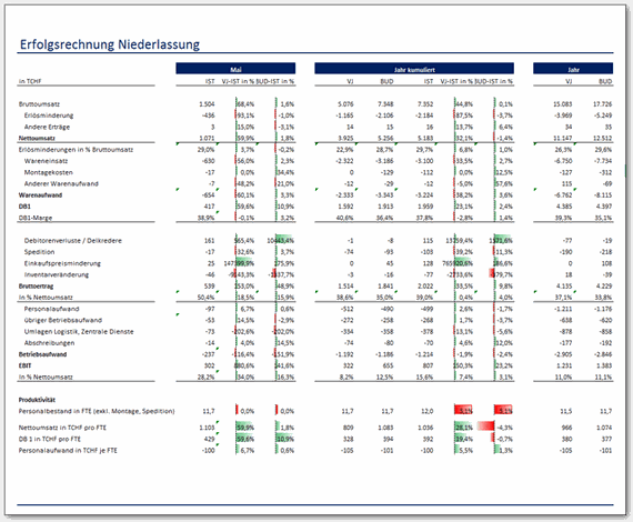
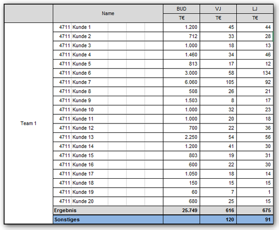
    To make this a little presentable, you build your own reports with VLOOKUP or other Excel formulas. The result is usually like the following:

    SAP Analysis for Office: BEx Analyzer result formatted
    SAP BEx Analyzer result formatted

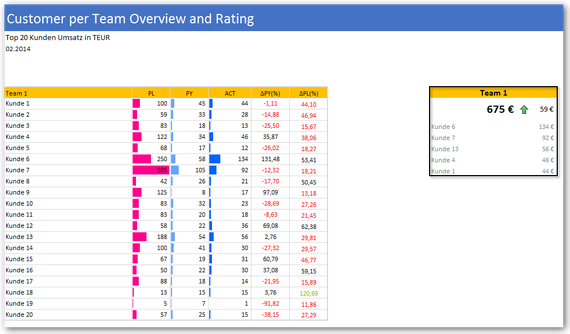
    Now this often fits into the corporate identity (CI) of the company. But it is often difficult to understand and contains also a lot of redundant information. The following dashboard is inspired
    by the HICHERT guidelines. This is still not perfect, but it shows what is possible.

    SAP Analysis for Office Simple Dashboard with Excel components
    Simple Dashboard with Excel components

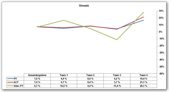
    Here another example of a diagram what not really says a lot.

    Ugly Excel chart with no statement
    Ugly Excel chart with no statement

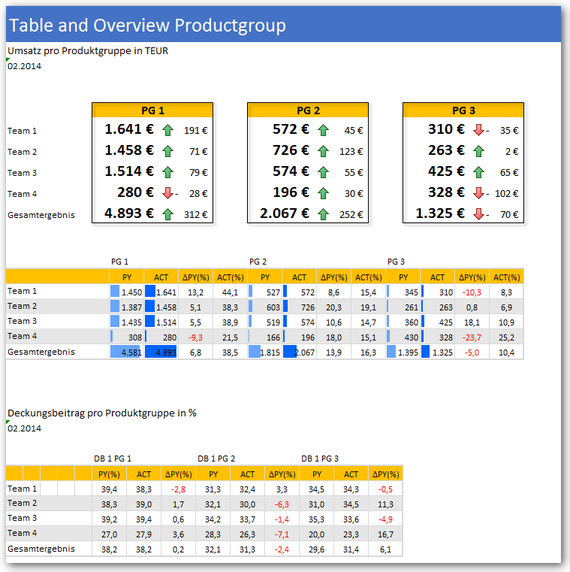
    In contrast, you can see on the following picture immediately, as the sales of each product group for the current month developed. In the team view you can see an overview over your profit
    margin.

    SAP Analysis for Office: Simple overview in Excel with a table and indicators
    Simple overview in Excel with a table and indicators

    Such simple dashboards are quickly created in Excel, unfortunately hardly anyone takes time for it. These examples were created in Excel 2010.
    With Excel 2013 you have more opportunities to present data.

    author.


    I am Tobias, I write this blog since 2014, you can find me on twitter and youtube. If you want you can leave me a paypal coffee donation. You can also contact me directly if you want.

  • How to convert a text field into a date field with VBA

    When you get a date from BEx Analyzer or Analysis Office the Excel internal format
    is Text and not Date. This means that the sorting doesn’t work correctly. Use the following VBA source code to convert easily text to date.


     1
     2
     3
     4
     5
     6
     7
     8
     9
    10
    11
    12
    13
    14
    15
    Sub Text_to_Date()
    
    Dim dDate As Date
    Dim dRange As Range
    
    Set dRange = Range(Selection.Address)
    
    For Each Cell In dRange
      If IsDate(Cell.Value) Then
        dDate = Cell.Value
        Cell.Value = dDate
      End If
    Next
    
    End Sub
    

    author.


    I am Tobias, I write this blog since 2014, you can find me on twitter and youtube. If you want you can leave me a paypal coffee donation. You can also contact me directly if you want.

  • Create own Excel formula

    In Excel you can quickly create very complex formulas. If you want to simplify your formula, you can also write your own function in VBA. Here is an example for calculating the percentage variance from the previous year.


    1
    2
    3
    4
    5
    Option Explicit
    
    Public Function prozent(source As Double, target As Double)
      prozent = Application.WorksheetFunction.IfError(IIf(target < 0,(source - target) / -target, (source - target) / target), 0)
    End Function


    As you can see, a very simple formula. For this purpose the sample as an Excel formula.


    =IFERROR(IF(targetCell < 0,(sourceCell – targetCell) / – targetCell,(sourceCell – targetCell / targetCell), 0)


    = (ACT) 215 – (PY) 204 / (PY) 204 = 0,055 = 5,5 %


    As you can see the own formula is more readable and can be easily combined with another formula.

    author.


    I am Tobias, I write this blog since 2014, you can find me on twitter and youtube. If you want you can leave me a paypal coffee donation. You can also contact me directly if you want.

  • Display SAP Minus keyfigures correct in Excel

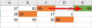
    Unfortunately, SAP export negative numbers like „Number-„:

    Excel minus figures display
    Excel minus figures display

    So you can work with this numbers, they must be changed to the format „-Number“. This can be done either by hand, which is very elaborate for a large list or you can use the following Excel
    formula:


    1
    =MAX(C1;-SUBSTITUTE(C1;"-";""))
    

    author.


    I am Tobias, I write this blog since 2014, you can find me on twitter and youtube. If you want you can leave me a paypal coffee donation. You can also contact me directly if you want.