reyemsaibot

SAP BI Blog about SAP BW/4HANA, Analysis for Office and SAP HANA - by Tobias Meyer

Autor: reyemsaibot

  • MTD/WTD/QTD/YTD calculation in SAP Datasphere

    Update 01/2025

    Name change from SAP Data Warehouse Cloud to SAP Datasphere. Some links may break

    There are different ideas and logics to determine year-to-date. Besides my post, which is also available on
    blogs.sap.com there is another post to determine a week-to-date (WTD) and year-to-date (YTD). I think
    that idea is also a good starting point, and I looked into it.

    Instead of a control table which I have to fill manually, I created a new SQL view based on the standard SAP timetables in Datasphere. First create a new SQL view in the Data Builder of
    Datasphere (DSP).

    SQL View in Datasphere
    SQL View in Datasphere

    After you have  a new SQL view, we now look into the SAP timetable for the day with the simple select statement:


    SELECT * FROM "SAP.TIME.VIEW_DIMENSION_DAY"


    Now we can open the data preview and see which fields are in the dimension view available and there we see a field with the name „DATE_SQL“ which we can use to create the logic. So let’s select
    only this field with the following statement:


    SELECT "DATE_SQL" FROM "SAP.TIME.VIEW_DIMENSION_DAY"
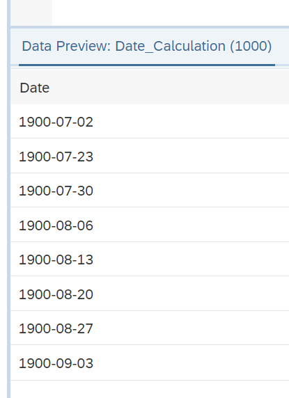


    DSP: Data preview date
    DSP: Data preview date

    So this is our start. For a week-to-date (WTD), month-to-date (MTD) and year-to-date (YTD) logic we need now further statement. So let’s start with the YTD logic because every year starts on
    01/01.


    SELECT "DATE_SQL",
    TO_DATE(YEAR("DATE_SQL")||'0101', 'YYYYMMDD') as YTD_START
           FROM "SAP.TIME.VIEW_DIMENSION_DAY"


    Let me explain the logic. First, we extract the year from the „DATE_SQL“ field to get the corresponding year of the data row. After that, we add here the string ‚0101‘ to build an SAP internal
    format of the date. For example 20220101 After we have that, we have to convert the SAP internal date format to a normal date format with the SQL statement TO_DATE.  Now, the data preview
    looks like this:

    DSP: Data preview YTD
    DSP: Data preview YTD

    Besides the year-to-date (YTD) value, the month-to-date (MTD) is also similar because every month starts at the first. This is the statement:


    SELECT "DATE_SQL",
    to_date(year("DATE_SQL")||right('0'||month("DATE_SQL"),2)||'01', 'YYYYMMDD') as MTD_START,
    TO_DATE(YEAR("DATE_SQL")||'0101', 'YYYYMMDD') as YTD_START
           FROM "SAP.TIME.VIEW_DIMENSION_DAY"


    The start is similar to the YTD logic. We get the month of the corresponding date and add a zero to the month. Now we take the two right digits of this result. In case of 010 for October we take
    the 10 and in case of 04 for April we take the 04. After that, we add 01 to it and have for example the string ‚0401‘. The next step is to get the year of the current date and concatenate it with
    the previous string to the SAP internal date format. For example 20220401. The last step is the conversion to a normal date with the TO_DATE statement. In the data preview, we have now this:

    DSP: Data preview MTD
    DSP: Data preview MTD

    The most complex part of the blog post I mentioned earlier was the week-to-date (WTD) calculation. Because every week starts not on the first of a month, and so I looked into other SQL logics not
    SAP specific what I can do. And this is how it looks like:


    SELECT "DATE_SQL",
    to_date(add_days("DATE_SQL", -(Weekday("DATE_SQL")))) AS WTD_START,
    to_date(year("DATE_SQL")||right('0'||month("DATE_SQL"),2)||'01', 'YYYYMMDD') as MTD_START,
    TO_DATE(YEAR("DATE_SQL")||'1231', 'YYYYMMDD') as YTD_END
           FROM "SAP.TIME.VIEW_DIMENSION_DAY"


    So let me explain it. We get the weekday of the date, for example for 15.02.2022 you get as result 1. Now, after we have the result of the weekday function, we make it negative with a minus.
    After that I use the ADD_DAYS function and add to the date in case of the 15.02.2022 a -1 and get the 14.02.2022 which was the week start. This is how it looks like in the data preview:

    DSP: Data preview WTD
    DSP: Data preview WTD

    Now we have the same table as mentioned in the SAP blog post. But I now wanted also the quarter start date, so I added the following logic:


    SELECT "DATE_SQL",
    to_date(add_days("DATE_SQL", -(Weekday("DATE_SQL")))) AS WTD_START,
    to_date(year("DATE_SQL")||right('0'||month("DATE_SQL"),2)||'01', 'YYYYMMDD') as MTD_START,
    TO_DATE(YEAR("DATE_SQL")||'1231', 'YYYYMMDD') as YTD_END,
    CASE right(quarter("DATE_SQL"),2)
        WHEN 'Q1' THEN to_date(year("DATE_SQL")||'0101', 'YYYYMMDD')
        WHEN 'Q2' THEN to_date(year("DATE_SQL")||'0401', 'YYYYMMDD')
        WHEN 'Q3' THEN to_date(year("DATE_SQL")||'0701', 'YYYYMMDD')
        WHEN 'Q4' THEN to_date(year("DATE_SQL")||'1001', 'YYYYMMDD')
    END as QTD_START
           FROM "SAP.TIME.VIEW_DIMENSION_DAY"


    So the case statement decides in case of the quarter which logic it has to use and adds for example ‚0401‘ for Q2. Here is how the data preview looks like:

    DSP: Data preview QTD
    DSP: Data preview QTD

    Now we can use the same logic mentioned in the blog post above to get the right values. Here is the SQL code as an example copied from the other post and expanded for the QTD logic.


    select "COSTCENTER",
           "BOOKINGDATE",
           "MATERIAL",
           "QUANTITY"   
     from "CSV_DATA"
     
     where "BOOKINGDATE" >= ( 
        SELECT CASE
                WHEN :DT_RANGE = 'MTD' THEN "MTD_START"
                WHEN :DT_RANGE = 'WTD' THEN "WTD_START"
                WHEN :DT_RANGE = 'QTD' THEN "QTD_START" 
                WHEN :DT_RANGE = 'YTD' THEN "YTD_START"
               END
        from "Date_Calculation"
        where "DATE_SQL" = TO_DATE(:IP_DATE)
        )
        AND "BOOKINGDATE" <= TO_DATE(:IP_DATE)


    I defined the DT_RANGE as input parameter with type string and length 3. The IP_DATE is an input parameter with the type date. Here is the example how it could look like when I analyze the
    quarter-to-date data for the date 05.05.2020.

    DSP: Data Preview Output
    DSP: Data Preview Output

    Conclusion

    I think this is another good example of what you can do in SAP Datasphere. I thank Sukanya Krishnan for the original idea, but with my solution I don’t have to upload a new file with new
    MTD/WTD/YTD values and this means less maintenance. If you have similar ideas, please share it in the comments.

    author.


    Hi,

    I am Tobias, I write this blog since 2014, you can find me on Twitter,
    LinkedInFacebook and YouTube. I work as a Senior Business Warehouse Consultant. In 2016, I wrote the first edition of . If you want, you can leave me a PayPal coffee donation. You can also contact me directly if you want.


  • MTD/QTD/YTD Calculation in SAP Datasphere

    Update 01/2025

    Name change from SAP Data Warehouse Cloud to SAP Datasphere. Some links may break

    In this blog post, I want to share an idea of how you can generate month-to-date (MTD), quarter-to-date (QTD), and year-to-date (YTD) values in SAP Datasphere (DSP). This is only one way, I think
    there are several other ways how you can solve this issue. I am happy to discuss your ideas in the comment section. In my old post, I describe the same logic for SAP HANA Calculation Views.

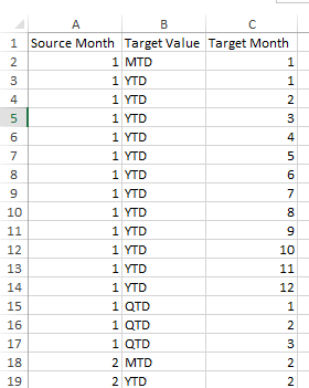
    Control Table

    The starting point is a control table that has the following structure:

    control table
    control table

    The whole table has entries for each source month.

    Data Table

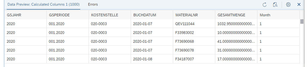
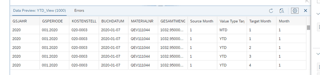
    After we have now the control table for the calculation, we now create a view. This is what the data looks like:

    data preview
    data preview

    Data Model

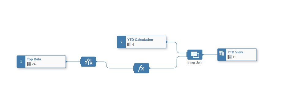
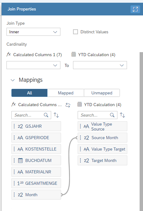
    Now we have the data and the calculation table, we just create a simple join to the data, which you see in the following screenshots.

    Join between control table and data table
    Join between control table and data table
    Join
    Join

    Output

    Output data preview
    Output data preview

    SAP Analytics Cloud Output

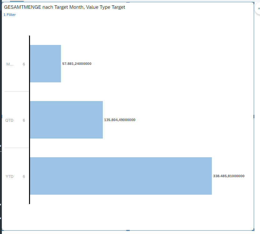
    With the value type, we can now filter our data for MTD/QTD/YTD and the corresponding month. In the SAC, it will look like this:

    YTD June Output
    YTD June Output

    In this example, I filter my data for June, and so I see directly the aggregated values. For the MTD you see the month value of 578881,24. For the QTD you get the values for the second quarter of
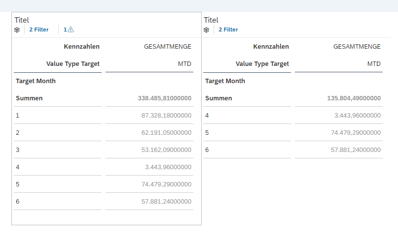
    the year and for the YTD you get the values of the entire year. Here are the MTD values to validate the chart

    MTD Output
    MTD Output

    Conclusion

    As you see, it works perfectly and is very fast. I had a similar post where I used this logic in one on Premise SAP HANA DB.

    What do you think about this solution? I know this is only one approach and there are more out there. Maybe someone has a better solution?

    author.


    Hi,

    I am Tobias, I write this blog since 2014, you can find me on Twitter,
    LinkedInFacebook and YouTube. I work as a Senior Business Warehouse Consultant. In 2016, I wrote the first edition of . If you want, you can leave me a PayPal coffee donation. You can also contact me directly if you want.


  • Analyze Apple Health data with Python

    It is a while since I published my last post here. There are several reasons that I don’t write anything, for example, SAP does not publish new features for Analysis for Office or my current
    project has no special cool new things I can talk about because it is mostly just maintenance and nothing hip. So it was very quiet here, and this is what I want to change. If you follow me on
    Twitter, you could have seen this post.

    So I will write some posts about Python, Data Warehouse Cloud, and some ABAP topics in the near future. This post starts with Python and how to analyze the Apple Health data.


    You can export the health data from your iPhone and receive a ZIP file that contains an XML file. How you can do this can be found via Google. It is uncomplicated. In my case, my XML file was around 1 GB big, and it contains about 3 million entries
    until May 2021. So I could not analyze it with Microsoft Excel or Notepad++, and I need only some information out of it, so I tried Python. I work with Python just more than one year, so please
    be kind if it is not perfectly written code.

    First we have to load the XML data. 

    from lxml import etree
    
    tree = etree.parse(r'path_to_xmlExport.xml')
    root = tree.getroot()
    # consider only records no workouts
    records = tree.xpath("//Record")
    

    With this code snippet, we load the XML file. We are only interested in the record data, so we read only this and not the workout data. If you are interested in your workout data, I will create
    another example. The XML path is here //Workouts. The next step is to get the data and put it into a data frame.

    import pandas as pd
    
    # fields we want to get
    DATETIME_KEYS = ["startDate", "endDate"]
    NUMERIC_KEYS = ["value"]
    OTHER_KEYS = ["type", "sourceName", "unit"]
    ALL_KEYS = DATETIME_KEYS + NUMERIC_KEYS + OTHER_KEYS
    
    # Get all records where as source the apple watch is
    df = pd.DataFrame([{key: r.get(key) for key in ALL_KEYS} for r in records if 'Apple' in r.attrib['sourceName']])
    

    Now we have all data in the data frame and can display it with df.tail()

    Raw data in a pandas data frame
    Raw data in a pandas data frame

    In this example I want to focus on my steps, so we filter for the type HKQuantityTypeIdentifierStepCount.

    df_steps = df.query('type == "HKQuantityTypeIdentifierStepCount"')


    Now we have in the new data frame df_steps only the step data. We can now save the data frame to a CSV file, and we can process it further.

    df_steps.to_csv("data_health/steps.csv", index=False)
    

    The XML file with almost 1 GB size has become a CSV file with 50 MB. Now you can use Microsoft Excel to open it or process the data further with Python. I found a blog post that also analyzes Apple Health data. I
    use this blog post to analyze my steps. First, we have to import some libraries.

    from datetime import date, datetime, timedelta as td
    import pytz
    import numpy as np
    import pandas as pd
    import matplotlib.pyplot as plt
    %matplotlib inline
    

    After that, I use the conversion for the time column to get time fields I can use for aggregation. In my case, I use the time zone Berlin.

    convert_tz = lambda x: x.to_pydatetime().replace(tzinfo=pytz.utc).astimezone(pytz.timezone('Europe/Berlin'))
    get_year = lambda x: convert_tz(x).year
    get_month = lambda x: '{}-{:02}'.format(convert_tz(x).year, convert_tz(x).month) #inefficient
    get_date = lambda x: '{}-{:02}-{:02}'.format(convert_tz(x).year, convert_tz(x).month, convert_tz(x).day) #inefficient
    get_day = lambda x: convert_tz(x).day
    get_hour = lambda x: convert_tz(x).hour
    get_minute = lambda x: convert_tz(x).minute
    get_day_of_week = lambda x: convert_tz(x).weekday()
    

    Now we add several columns like the year, month, date, hour, day of the week.

    df_steps['startDate'] = pd.to_datetime(df_steps['startDate'])
    df_steps['year'] = df_steps['startDate'].map(get_year)
    df_steps['month'] = df_steps['startDate'].map(get_month)
    df_steps['date'] = df_steps['startDate'].map(get_date)
    df_steps['day'] = df_steps['startDate'].map(get_day)
    df_steps['hour'] = df_steps['startDate'].map(get_hour)
    df_steps['dow'] = df_steps['startDate'].map(get_day_of_week)
    

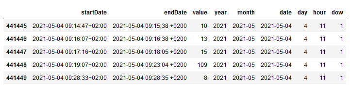
    With df_steps.tail() we can look into the data frame and it looks like this:

    Raw data steps with date/time fields
    Raw data steps with date/time fields

    So we can aggregate the steps by date to summarize all records of one day into one single record.

    steps_by_date = steps.groupby(['date'])['value'].sum().reset_index(name='Steps')
    

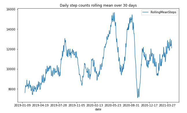
    We can use the new data frame to visualize the result in a line chart diagram. I use the mean value of 30 days to show me an overview. You can change the value to your desire.

    steps_by_date['RollingMeanSteps'] = steps_by_date.Steps.rolling(window=30, center=True).mean()
    steps_by_date.plot(x='date', y='RollingMeanSteps', title= 'Daily step counts rolling mean over 30 days', figsize=[10, 6])
    

    This is how it looks:

    Steps counts rolling mean over 30 days
    Steps counts rolling mean over 30 days

    As you can see, I have a drop around the COVID-19 start, and as the lockdown in Germany started, I have an increase because we have done a lot of walking with the family. I think this is
    impressive to see and to analyze for further analysis. So the next step is to get an overview of the weekdays. Therefore, we have to add the weekday to our data frame and visualize it in a
    diagram.

    steps_by_date['date'] = pd.to_datetime(steps_by_date['date'])
    steps_by_date['dow'] = steps_by_date['date'].dt.weekday
    
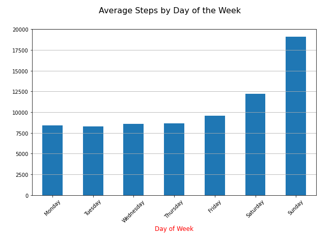
    data = steps_by_date.groupby(['dow'])['Steps'].mean()
    
    fig, ax = plt.subplots(figsize=[10, 6])
    ax = data.plot(kind='bar', x='day_of_week')
    
    n_groups = len(data)
    index = np.arange(n_groups)
    opacity = 0.75
    
    ax.yaxis.grid(True)
    
    plt.suptitle('Average Steps by Day of the Week', fontsize=16)
    dow_labels = ['Monday', 'Tuesday', 'Wednesday', 'Thursday', 'Friday', 'Saturday', 'Sunday']
    plt.xticks(index, dow_labels, rotation=45)
    plt.xlabel('Day of Week', fontsize=12, color='red')
    
    Average Steps by Day of the Week
    Average Steps by Day of the Week

    The diagram shows what I already know. I do the most steps on the weekend. But I think it is also interesting that I have overall (2019 – 2021) nearly 8000 steps per day. And when I look into
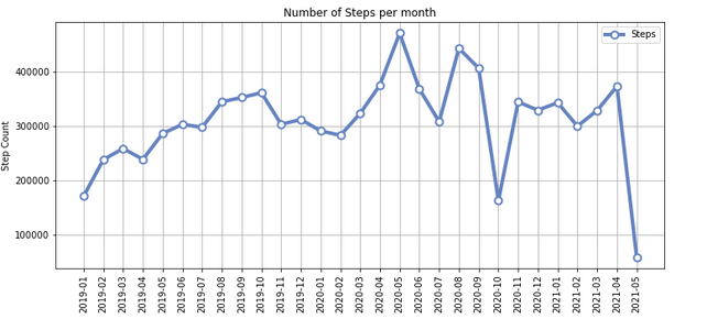
    2021, only I have now almost 10,000 steps, even though I am still in my home office since COVID-19 started. Next, I created an overview of my monthly steps. In the monthly chart, we see an
    increase during the lockdown in Germany, where you could go out for a walk or run. 

    df_steps['value'] = pd.to_numeric(df_steps['value'])
    total_steps_by_month = df_steps.groupby(['month'])['value'].sum().reset_index(name='Steps')
    
    total_steps_by_month
    

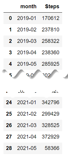
    The total_steps_by_month now has all steps of each month summed up, and this is how it looks like:

    Overview monthly steps
    Overview monthly steps

    After looking into the data, I now want to display it as a chart.

    dataset = total_steps_by_month
    chart_title = 'Number of Steps per month'
    
    n_groups = len(dataset)
    index = np.arange(n_groups)
    
    ax = dataset.plot(kind='line', figsize=[12, 5], linewidth=4, alpha=1, marker='o', color='#6684c1', 
                          markeredgecolor='#6684c1', markerfacecolor='w', markersize=8, markeredgewidth=2)
    
    ax.yaxis.grid(True)
    ax.xaxis.grid(True)
    ax.set_xticks(index)
    ax.set_ylabel('Step Count')
    plt.xticks(index, dataset.month, rotation=90)
    ax.set_title(chart_title)
    
    plt.show()
    
    Number of Steps per month
    Number of Steps per month

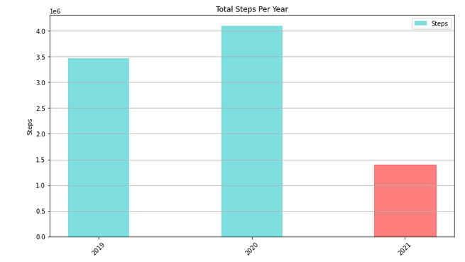
    The last chart is an overview of my steps per year, which I already knew from the iPhone app Stepz.

    Total steps per year
    Total steps per year

    As I now have my data, I could also save it as a CSV file for later use and analyze the hours when I made my steps. It is interesting what you can do with all of this data.

    Conclusion

    So that’s it. I think it is only the iceberg tip of what you can do with Apple Health data. The next steps are to look into the heart rate and how it developed with my running exercises during
    the two years and the visualization of GPS data. Maybe someone can provide me with a few tips, so I can improve my Python skills. Is there any good video course or book I should read? Leave a
    comment below.

    author.


    Hi,

    I am Tobias, I write this blog since 2014, you can find me on Twitter,
    LinkedInFacebook and YouTube. I work as a Senior Business Warehouse Consultant. In 2016, I wrote the first edition of . If you want, you can leave me a PayPal coffee donation. You can also contact me directly if you want.


  • Comparing of data flows through SAP Landscape

    It is quite a while since I published my last post. A lot happened since then. Analysis for Office 2.8 SP10 is now available, the summer and the vacation  are over. But in the meantime
    I developed some new ABAP tools, had quite some interesting exchange and took the SQL Script course by Jörg
    Brandeis
    . But in this blog post I want to share with you the latest tool I developed which compare transformations in SAP Business Warehouse systems through the landscape.


    Here is a short overview:

    The tool allows you to compare and check the following information:

    • Global Transformation Information
    • Global Routine
    • Field, Start, End and Expert routine
    • Mapping
    • Constants
    • Data Transfer Process Information
    • Data Transfer Process Filter (Fields and Coding)
    • Data Transfer Process Semantic Groups

    So you see on the first sight if something is different between your SAP landscape. You can also see on which transports are your transformation was and how the import status is.

    Conclusion

    This tool allows you to reduce the maintenance in your SAP landscape and display directly the differences. You can either start with a specific transformation or with a source or target, which
    means the complete data flow will be analyzed. If you have any ideas to extend this program, please let me know.

    author.


    Hi,

    I am Tobias, I write this blog since 2014, you can find me on Twitter,
    LinkedInFacebook and YouTube. I work as a Senior Business Warehouse Consultant. In 2016, I wrote the first edition of . If you want, you can leave me a PayPal coffee donation. You can also contact me directly if you want.


    You want to know SAP Analysis for Office in a perfect detail?
    You want to know how to build an Excel Dashboard with your Query in Analysis for Office? 
    You want to know how functions in SAP Analysis for Office works?


    Then you have to take a look into Analysis for Office  – The Comprehensive Guide. Either as a video course or as an e-book.


  • Analysis for Office 2.8 SP8 is available

    Since last week Analysis for Office 2.8 SP8 is available, and you can download it with your S-User. I just got a question if I could write about it, so here are the notes which fixes some bugs:


    • AO 2.x: Template for patch for AO and AO_SAC (s-note 3035301)
    • AO: SAC Live Data Connections – Input Readiness of BW planning queries can’t get restored when opening a saved workbook (s-note 3038493)
    • Array formula cannot be updated via VBA (s-note 3017643)
    • BW OLAP Connection in Analysis Office Workbook Targets a Wrong System after Promotion (s-note 2972912)
    • Date format in AfO Schedule different than normal run (s-note 3001137)
    • New Lines – Value Help exception while opening if search is disabled [f197-731f-8e] (s-note 3019161)
    • SAPSetData: Introduced Option „InitValue“ (s-note 3028120)


    Conclusion

    So you see the latest update of Analysis for Office don’t fix very much. I think SAP is almost done with Analysis for Office, because the what’s new guide only shows two new features:

    • SAP Analytics Cloud Live Data connections
    • Technical Setting DisableBWDirectSearch 


    So the product is almost finished? What is still with a connection to Data Warehouse Cloud?

    author.


    Hi,

    I am Tobias, I write this blog since 2014, you can find me on Twitter,
    LinkedInFacebook and YouTube. I work as a Senior Business Warehouse Consultant. In 2016, I wrote the first edition of . If you want, you can leave me a PayPal coffee donation. You can also contact me directly if you want.


  • Datasphere: Restrict Data Access in Hierarchies

    Update 01/2025

    Name change from SAP Data Warehouse Cloud to SAP Datasphere. Some links may break.

    In the last post I wrote about authorizations in SAP Datasphere and I had an open topic
    about authorization on hierarchy nodes in SAP DSP. So I looked into and here is one example of how it could work at the moment. I don’t know if SAP changes something in future releases.


    So let us started with a CSV file to create our authorization we can use in the SAP Datasphere. I would now authorize my user to a Product Category because my hierarchy looks like this:

    • Product Category 01
      • Product 1
      • Product 2
    • Product Category 02
      • Product 3
      • Product 4

    So we have the same structure as in the last post:

    Product Category

    Product Category 01


    Be aware that the technical key of the product category is used for authorization. After we uploaded this table and created a data access control (how this works can be read in the last post) we also need a hierarchy on our product table. 


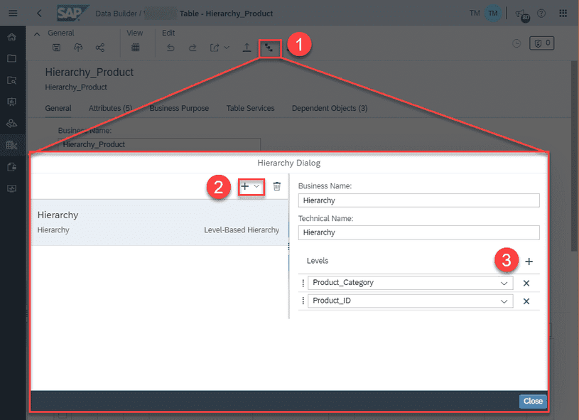
    So we go to the Data Builder and choose our space and either upload a CSV file or create a new table with the semantic usage „Dimension“. I used a CSV file, and now we can create a hierarchy on
    this dimension table.

    Create a hierarchy in SAP Datasphere
    Create a hierarchy in SAP Datasphere

    In the hierarchy dialog, we create a new hierarchy and the corresponding levels. In my case, you see above the levels are product category and then the product ID. After clicking on Close the
    hierarchy is created. We can now save and deploy our dimension table again to make sure all changes are applied.

    View in SAP Data Warehouse
    View in SAP Data Warehouse

    Now we create a new graphical view and there we join the fact table with the dimension table. It is called associations. Click on the plus sign and select an association target. In this case, it
    is the Product Hierarchy. Now the system matches automatically the product ID of the fact table with the product ID of the hierarchy dimension. In case it doesn’t work automatically, you have to
    make the connection for the join.

    Create Association in the Model Properties of the View
    Create Association in the Model Properties of the View
    Check Mapping between the view and the association
    Check Mapping between the view and the association

    After we add the hierarchy dimension, we now add the data access control to restrict the data of the view. Click on the plus sign to add a data access control we created earlier.

    Add Data Access Control in SAP Datasphere
    Add Data Access Control in SAP Datasphere
    Check Mapping between the view and the data access control in Datasphere
    Check Mapping between the view and the data access control in Datasphere

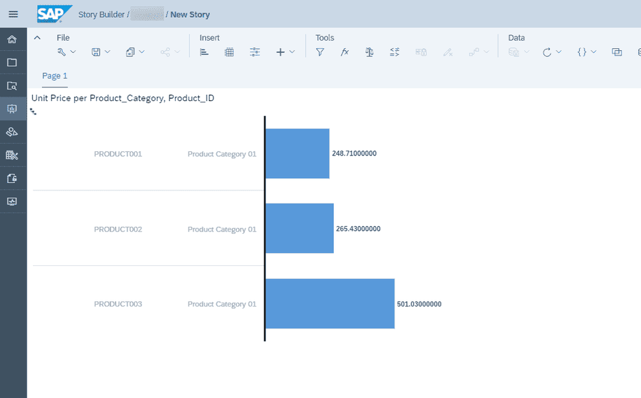
    As before, you have to map the fields of the sales view and the data access control. At the end save the view and deploy it. We switch to the Story Builder and create a new chart based on
    the sales view we just deployed. Select as source the sales view and add the product to the dimension and unit price to the measures. 

    Hierarchy Node with Children are visible
    Hierarchy Node with Children are visible

    As you see the data access control restricts the product ID with the product group we assigned before.

    Conclusion

    The restriction on a certain hierarchy node is common-use in several companies. In this post, I described one way you could build it. I don’t know if there are other ways in the future.

    author.


    Hi,

    I am Tobias, I write this blog since 2014, you can find me on Twitter,
    LinkedInFacebook and YouTube. I work as a Data & Analytics Consultant. If you want, you can leave me a PayPal coffee donation. You can also contact me directly if you want.


  • Authorizations with Data Access Control in SAP Datasphere

    Update 01/2025

    Name change from SAP Data Warehouse Cloud to SAP Datasphere. Some links may break

    In this blog post I want to show you how you can use data authorizations in SAP Datasphere. First, we have to log on to our SAP Datasphere and select the space we want to use for this.


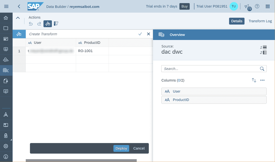
    After we have selected our space, we open the Data Builder of SAP Datasphere. Here we have to import a new table with our authorizations. In my case we want to filter the Product ID, so the table
    looks like this:

    User

    ProductID


    User_email@dwc_tenant.de

    RO-1001


    SAP Datasphere Import Table
    SAP Datasphere Import Table

    You have to define the user with the logged on email address and the column for the data you want to restrict. Now we upload and deploy this table to our space and give it the name
    Authorization_Example.

    SAP Datasphere Deploy Table
    SAP Datasphere Deploy Table

    Now after we have deployed this table to the space, we switch to the Data Access Control, which we select in the menu bar. Here we can create a new Data Access Control we need to restrict our
    data access later. When we create a new Data Access Control we have to select the table we want to use for the Authorizations. In this case the table has the name Authorization_Example with the
    columns User and ProductID.

    SAP Datasphere Create Data Access Control
    SAP Datasphere Create Data Access Control
    SAP Datasphere Select authorization table
    SAP Datasphere Select authorization table

    After we have selected the table, we have to make some adjustments for the Data Access Control. First, we have to define a Business Name, a Technical Name and define the Principal Name Column as
    well as the Output column. We can also enter a responsible person for this Data Access Control. After we have done this, we can save and deploy our Data Access Control to use it.

    SAP Datasphere Define Data Access Control
    SAP Datasphere Define Data Access Control

    Now I describe as first way how to use it in a view and after how to use it in a SAP Datasphere Dimension as well as Consumption Model. So, let’s start with the view. Select the Data Builder
    and create a new Graphical View.

    SAP Datasphere Create new graphical view
    SAP Datasphere Create new graphical view

    We use the table Products and connect it to the output of the view. Now we select the properties of the view and select there the + icon under Data Access Control to add a new Data Access
    Control. 

    SAP Datasphere Add authorizations to view
    SAP Datasphere Add authorizations to view

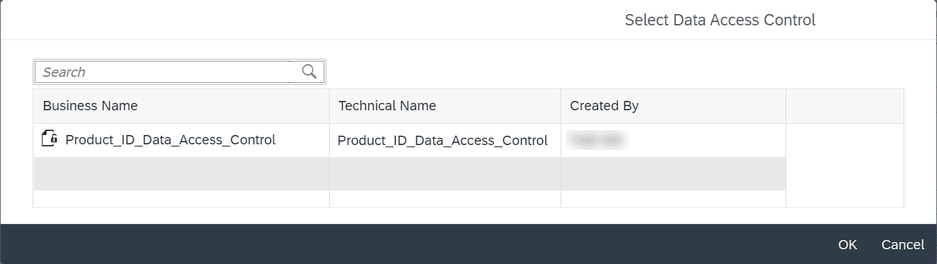
    In the new dialog we can select one of our defined Data Access Controls and use it. In this case we have one for the Product ID.

    SAP Datasphere Select Data Access Control
    SAP Datasphere Select Data Access Control

    After we have selected it, we see the properties of the view again and see a point called join. Here we have to join our view with the Data Access Control.  Now after we have joined our view
    with the Data Access Control, we look into the data preview of our original table and then of the view.

    SAP Datasphere Join view with Data Access Control
    SAP Datasphere Join view with Data Access Control

    As you see in the original table, we can see all entries of the table and when we now look into the view, we see that the Data Access Control is working because we only see the Product we defined
    above. This was the first way. Now I show you the way how to use the Data Access Control in Dimensions and Consumption Models.

    So, let’s select the Business Builder and here we create a new Authorization Scenario we need to use later. We have to select a Data Access Control and create out of it our new Authorization
    Scenario.

    SAP Datasphere Create Authorization Scenario
    SAP Datasphere Create Authorization Scenario
    SAP Datasphere Create Authorization Scenario with Data Access Control
    SAP Datasphere Create Authorization Scenario with Data Access Control

    In the Authorization Scenario we can define our Data Restriction. In my case it is the Target Business Entity Products with the Target Key Product ID. After we saved our Authorization Scenario,
    we switch to the dimension Products and select the tab Authorization Scenarios. Here we click on the + sign to add an Authorization Scenario. We select the Authorization Scenario we just created.
    We can do the same on the Analytical Data Set.

    In the Consumption Model we have to add our Authorization Scenario under the General tab. When we now open the data preview of our Consumption Model, we see under the settings the Authorization
    Scenario we can select. As you can see, we have here our Product ID Scenario. When we select it, the data will be restricted, and we only see the data we are allowed to.

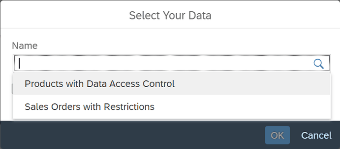
    The last step is to use this Consumption Model in the embedded SAP Analytics Cloud. Therefore, we switch to the Analytics Application and create a new story in this workspace. Now we select our
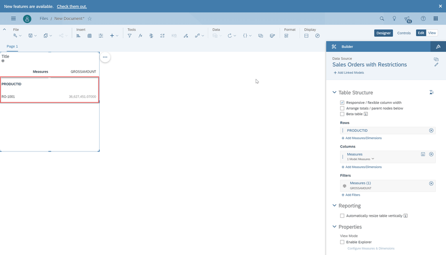
    Consumption Model, here Products with Data Access Control and use the table template. When we now add the Product ID to the rows, you see the data will be restricted.

    SAP Analytics Cloud Select Data for Story
    SAP Analytics Cloud Select Data for Story
    SAP Analytics Cloud Story with Table and Authorization
    SAP Analytics Cloud Story with Table and Authorization

    Conclusion

    At first, I was little confused about this solution but after implementing it, it makes really sense. Because I don’t have only BW/4HANA sources, so I could not use the Authorization from
    BW/4HANA. And I am very flexible with this authorization table and can also expand it for more columns. The only thing is I don’t figure out yet is an authorization on a hierarchy which is very
    common in BW/4HANA. Maybe someone has an idea?

    These posts might also be interesting:

    author.


    Hi,

    I am Tobias, I write this blog since 2014, you can find me on Twitter,
    LinkedInFacebook and YouTube. I work as a Data & Analytics Consultant. If you want, you can leave me a PayPal coffee donation. You can also contact me directly if you want.


  • Create a time hierarchy in SAP Datasphere

    Update 01/2025

    Name changed from SAP Data Warehouse Cloud to SAP Datasphere. Some links may break

    Someone ask me how you could create a time hierarchy in SAP Datasphere (DSP) to use it in SAP Analytics Cloud (SAC). Because out of the box by just create the time dimension it isn’t working
    right now. So here are the steps you have to make.

    1. Create a new Space

    First we create a new space and start from scratch.

    SAP Datasphere Create new space
    SAP Datasphere Create new space
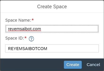
    SAP Datasphere Create space reyemsaibot.com
    SAP Datasphere Create space reyemsaibot.com

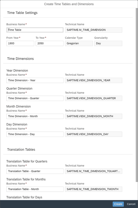
    After we created our new space and added our user to this space, we are able to create the time dimensions direclty in SAP Datasphere.

    SAP Datasphere Add time dimension to space
    SAP Datasphere Add time dimension to space
    SAP Datasphere Create time dimension
    SAP Datasphere Create time dimension

    2. Data Builder and Upload an own file

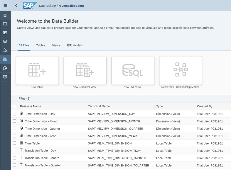
    Now we see in the Data Builder of the SAP Datasphere the time dimensions we just created. 

    SAP Datasphere Data Builder
    SAP Datasphere Data Builder

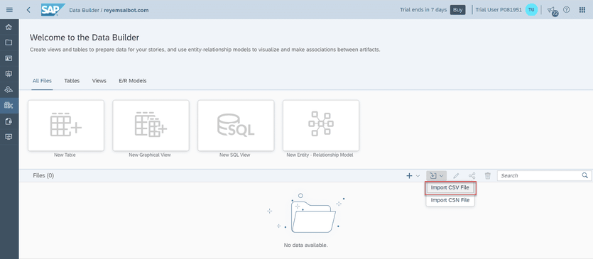
    To show you an example I need to upload some example data. We use for this the CSV-File upload functionality of Datasphere. 

    SAP Datasphere Import CSV File
    SAP Datasphere Import CSV File

    My example file here are the sales orders with a date in one column, so we can build our hierarchy.

    SAP Datasphere Import CSV File
    SAP Datasphere Import CSV File

    3. Create a new graphical view

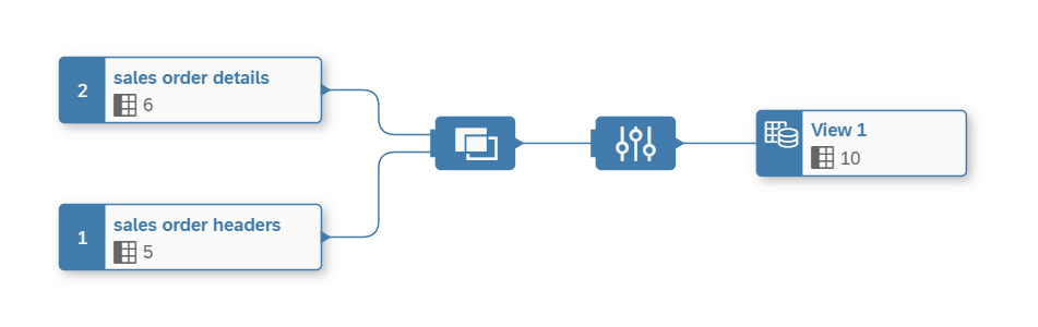
    After I uploaded my files, we can create a new graphical view to associate our time dimension to our sales data.

    SAP Datasphere Graphical View
    SAP Datasphere Graphical View

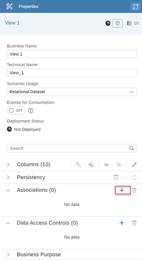
    As you see the view is very simple we just join the sales order header with the details. Now we can assign in the properties of the view element our time dimension.

    SAP Datasphere Properties of View
    SAP Datasphere Properties of View

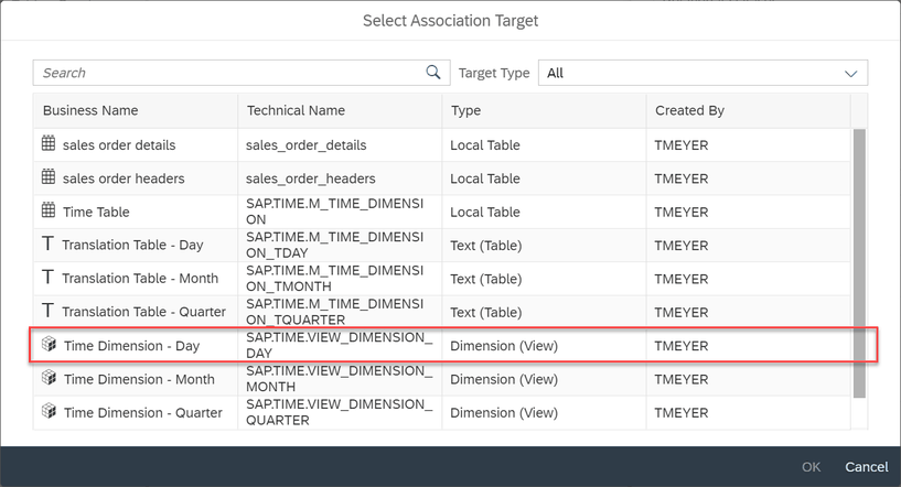
    Now we can select our association target and here we select the time dimension day and click OK.

    SAP Datasphere Select association target
    SAP Datasphere Select association target

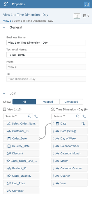
    Now we have to join our view with the time dimension. In my case I use the order date for my hierarchy.

    SAP Datasphere Join between view and association target
    SAP Datasphere Join between view and association target

    As penultimate step of this view we define our view as an Analytical Dataset and expose it for consumption.  As last step we save and deploy our view to make it available in the SAP
    Analytics Cloud.

    4. Create SAC Story

    Now after we have deployed our view we can switch through the application switcher to the SAP Analytics Cloud.

    SAP Datasphere Switch to SAP Analytics Cloud
    SAP Datasphere Switch to SAP Analytics Cloud

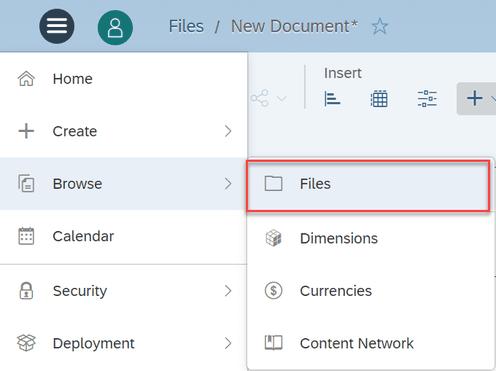
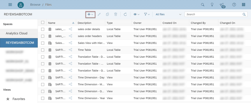
    We open via the menu our corresponding space and create a new story there.

    SAP Analytics Cloud Browse Files
    SAP Analytics Cloud Browse Files
    SAP Analytics Cloud Create new story
    SAP Analytics Cloud Create new story

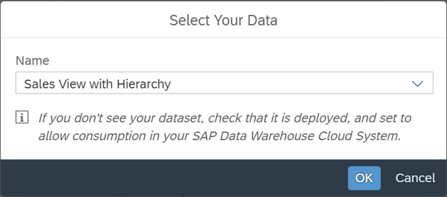
    Here we have to select our Analytical Dataset.

    SAP Analytics Cloud Select Dataset
    SAP Analytics Cloud Select Dataset

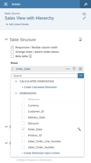
    After we selected our Analytical Dataset, we choose for the demonstration a table to show the hierarchy.

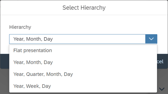
    Now we add the Order Date to our table and can select our corresponding hierarchy.

    SAP Analytics Cloud Add dimension with hierarchy
    SAP Analytics Cloud Add dimension with hierarchy
    SAP Analytics Cloud Select Hierarchy
    SAP Analytics Cloud Select Hierarchy

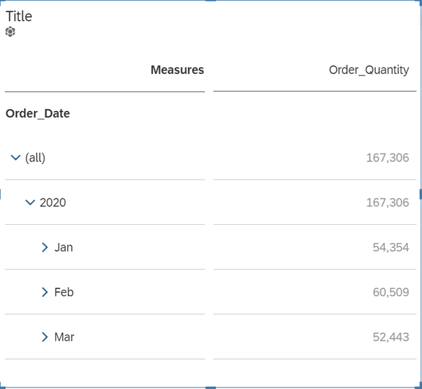
    As you see our table shows the time hierarchy.

    SAP Analytics Cloud Story with Table and Time Hierarchy
    SAP Analytics Cloud Story with Table and Time Hierarchy

    Conclusion

    When you know where the options are, it is not heavy to build a time hierarchy in SAP Datasphere and use it in SAP Analytics Cloud. I hope this will help to get started with Datasphere. If you
    have any questions, feel free to ask in the comments.

    author.


    Hi,

    I am Tobias, I write this blog since 2014, you can find me on Twitter,
    Facebook ,and YouTube. I work as a Data & Analytics
    Consultant. If you want, you can leave me a PayPal coffee donation. You can
    also contact me directly if you want.


  • BW/4HANA Query Link Components

    In BW/4HANA SAP offers you the possibility to link restricted or calculated key figures across different Composite Providers. The advantage of the link components concept is that they can
    automatically synchronize whenever you make changes in the source or master component. If you are not familiar with this concept.


    SAP Help:

    A linked component can be automatically synchronized whenever changes are made to the corresponding source component.

    Example scenario: You have two highly similar InfoProviders, IP_A and IP_B. You have created the query Q_A for IP_A. You now want to create the query Q_B for
    InfoProvider IP_B. You want this query to be very similar to query Q_A and to be automatically adjusted whenever changes are made to query Q_A.

    To do this, you use the link component concept: You create the linked target query Q_B for source query Q_A. This is more than just a copy, as the system also
    retains the mapping information. This mapping information makes it possible to synchronize the queries.

    So the concept is really nice because you can ensure that your key figures with the same name has also the same configuration, e.g. your turnover is configured correctly on any Composite Provider
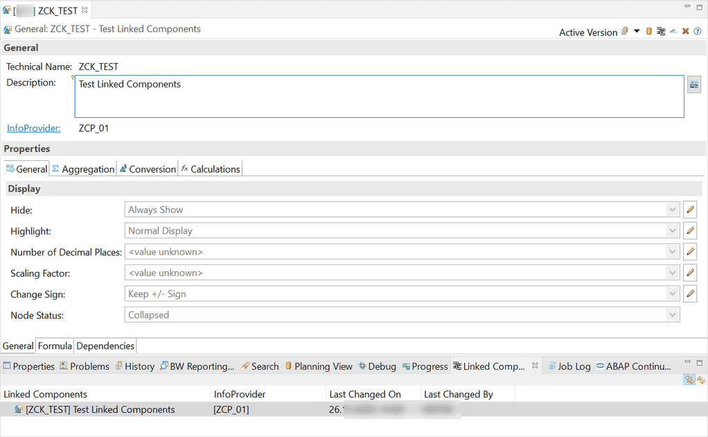
    in your system. Now let’s create a new link component. First we select a restricted key figure on our Composite Provider and goto „Linked Component“ view in Eclipse.

    New Keyfigure in Eclipse
    New Keyfigure in Eclipse

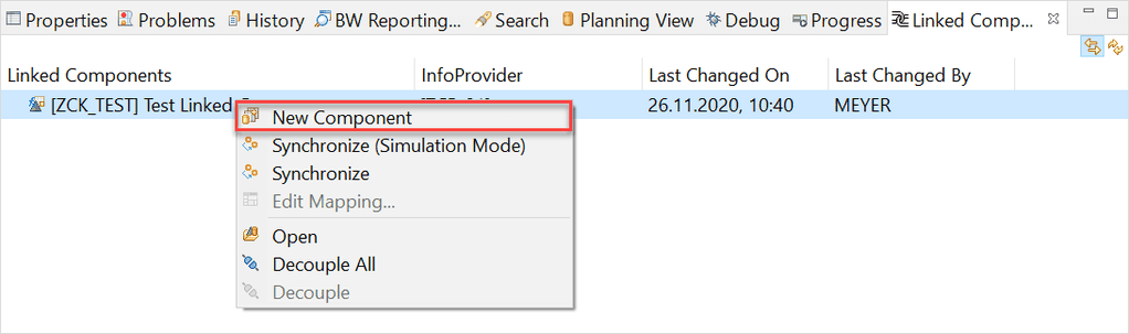
    Use the right click on the key figure in the „Linked Component“ view and select „New Component“

    New Query Link Component
    New Query Link Component

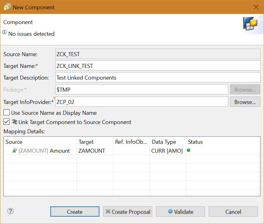
    A new dialog appears, which allows us to create a new linked key figure. First we have to define a Target Name and a Target InfoProvider. Now we can click on Create Proposal.

    Create new Query Link Component
    Create new Query Link Component

    After the status is green, we can create this new link component.

    Keyfigure with Link Component
    Keyfigure with Link Component

    So now let’s come to an issue what happen when you unlink your query components by mistake. Here the trouble begins. There is no function to link your broken query link component again to the
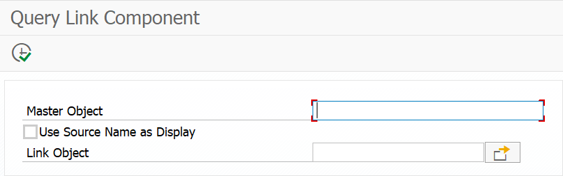
    original target. Which means you have to create a new link component and replace it in all your queries but for this I create a little tool called Query Link Component to link the components again.


    Query Link Component Tool
    Query Link Component Tool

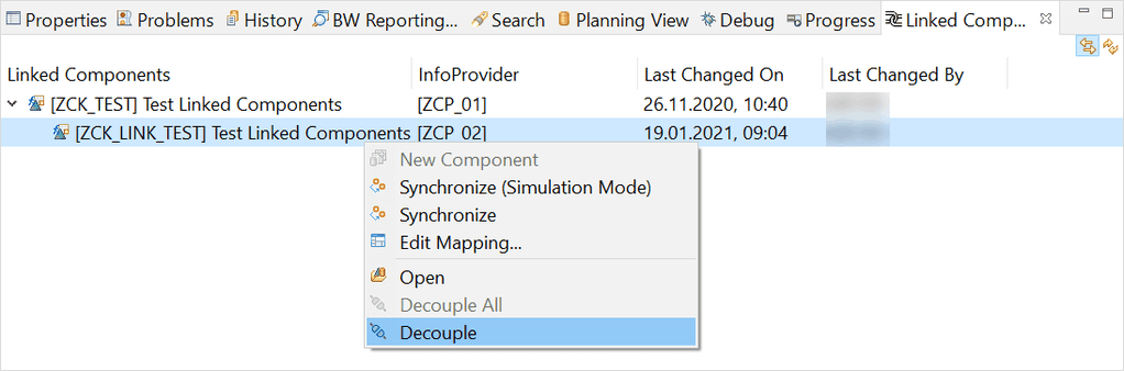
    So let’s make an example, we just decouple our created link component and link it afterwards again.

    Decouple an existing link component
    Decouple an existing link component
    Keyfigure without Link Component
    Keyfigure without Link Component

    Now we open the Query Link Component program and fill out all necessary information and link our key figure again.

    Create the Link Component again
    Create the Link Component again

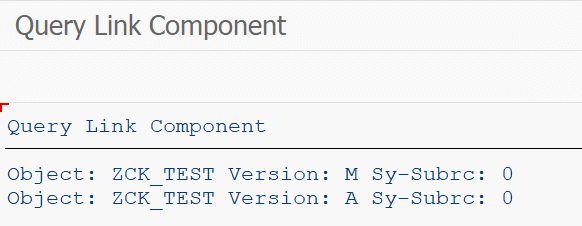
    Click on Execute (F8)

    Linking was successful
    Linking was successful

    Now we close and reopen the key figure in Eclipse, and we will see the link component is back again.

    Query Link Component works again
    Query Link Component works again

    Conclusion

    I like the concept of linked components in BW/4HANA, but I don’t know why SAP has no such function to link a broken query component again. My little tool helps me to fix this issue and save me a
    lot of time. Do you use the Link Components Concept in your BW/4HANA?

    author.


    Hi,

    I am Tobias, I write this blog since 2014, you can find me on Twitter,
    LinkedInFacebook and YouTube. I work as a Senior Business Warehouse Consultant. In 2016, I wrote the first edition of . If you want, you can leave me a PayPal coffee donation. You can also contact me directly if you want.


  • BW/4HANA XXL InfoObjects

    Last week a colleague and I look into the XXL InfoObjects in SAP BW/4HANA. We searched the online help and there is a short video about the topic. But after that we
    had no clue how we can use it. Can we use it in Analysis for Office? Or just in the query or Composite Provider? What is the purpose of these InfoObjects? Can we store a documentation and open it
    directly from the query?

    So I build an example XXL InfoObject and added it as a XXL Attribute to an InfoObject. This InfoObject was in my Composite Provider, so I looked into the Composite Provider with Analysis for
    Office and don’t see the XXL InfoObject. So we are back to start. What can I do with it? Now I asked around on twitter. And I was surprised about the answers.

    Jakob wrote:

    „Its not only to use it. You have to maintain, visualize and to report it. One of the miracles. Man people wants it , test it……a few scenarios which is
    valueble…..“


    Roland
    wrote:

    „Indeed, looked
    promising, never found a usecase“


    Georgios
    wrote:

    „I don’t see any use case to be honest. I wanted to use them once to report on some quite long text values until I realized they can’t be used in reporting.“


    Jakob wrote:

    We used it in planning application to comment keyfigures. Onother case was to integrate PDF in dashbords for documentations. Another usecase was to Integrated CAD
    drawings in a dashboard for Real Estate application. To store is not the problem anymore. To visualize edit etc..


    Jakob wrote:

    We used WAD and in the row there was displays a icon. After clicking you got a separete window. I have to look for the fuba or Some documentation. It was not
    completly visible! Thats what i mean vizualising and reporting can be a challenge 🙂


    Marc wrote:

    Haven’t tried but the announcement included an example https://blogs.sap.com/2019/09/23/improvements-of-bw4hana-analytical-engine-in-q3-2019-with-nw-bw-sp16-or-q1-2020-with-bw4hana-2.0-sp4/


    Conclusion

    So now I have a possible purpose but no clue how to use it exactly. Maybe someone from SAP can light me up? Or show some use cases? Thanks to all answers, maybe someone has another good idea? You
    can leave it in the comments.

    author.

    Hi,

    I am Tobias, I write this blog since 2014, you can find me on Twitter,
    LinkedInFacebook and YouTube. I work as a Senior Business Warehouse Consultant. In 2016, I wrote the first edition of . If you want, you can leave me a PayPal coffee donation. You can also contact me directly if you want.